Summary
Mixed-Use development comprising 6 storey office; 6 storey apartment building; new public plaza; existing 14th century church.
The Brief
Provide a new city centre public space surrounded with lettable office space; residential apartments; and an improved setting for the historic church.
Overview
This project was undertaken whilst our director, Sean Stanley, was working for Dyer Brown in London.
The site was currently used as an open-air private carpark. At one end of this carpark a 14th century church felt inaccessible and neglected; at the other end the site opened up with views towards the river.
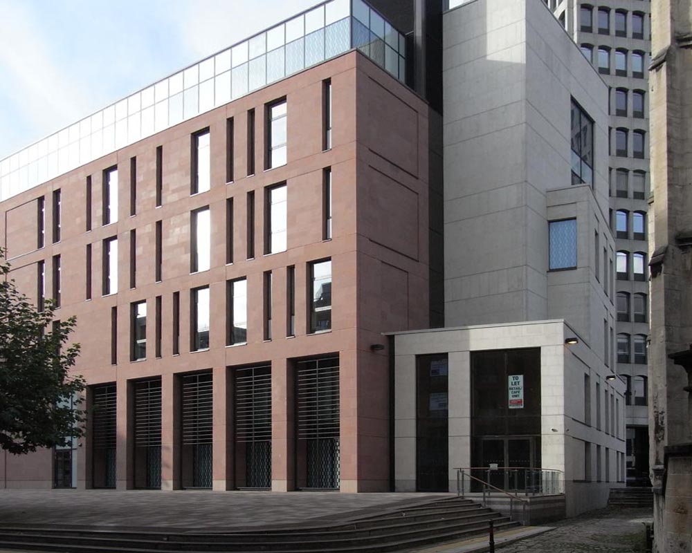
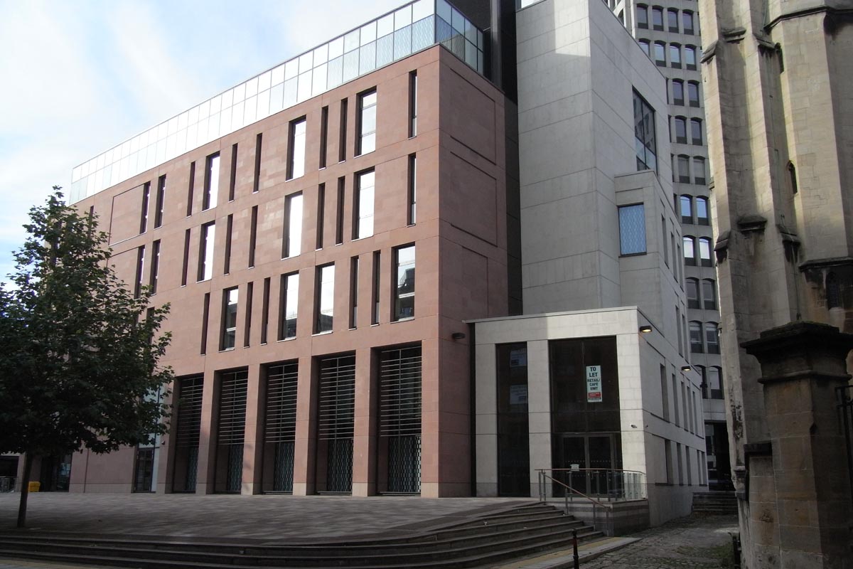
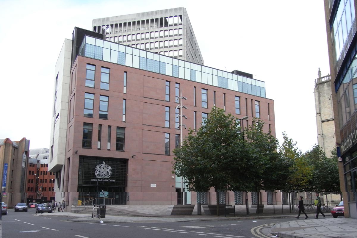
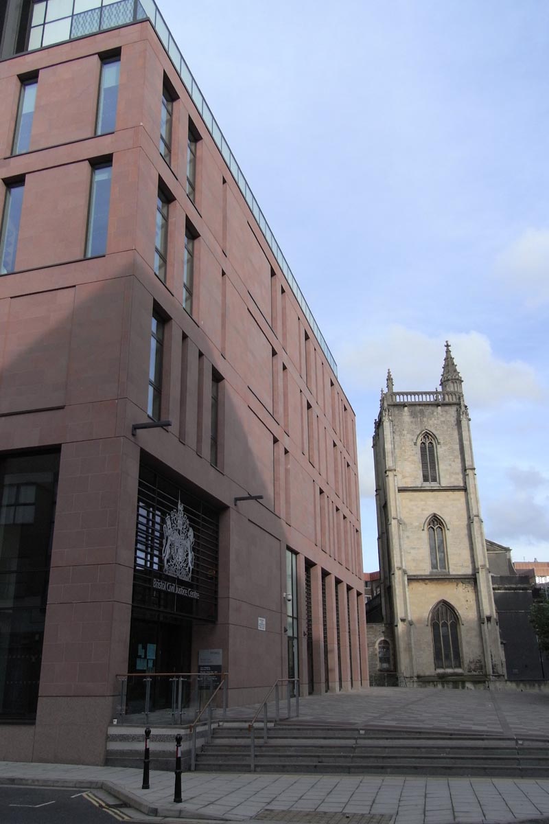
View of new office with church to the right.
Public Space
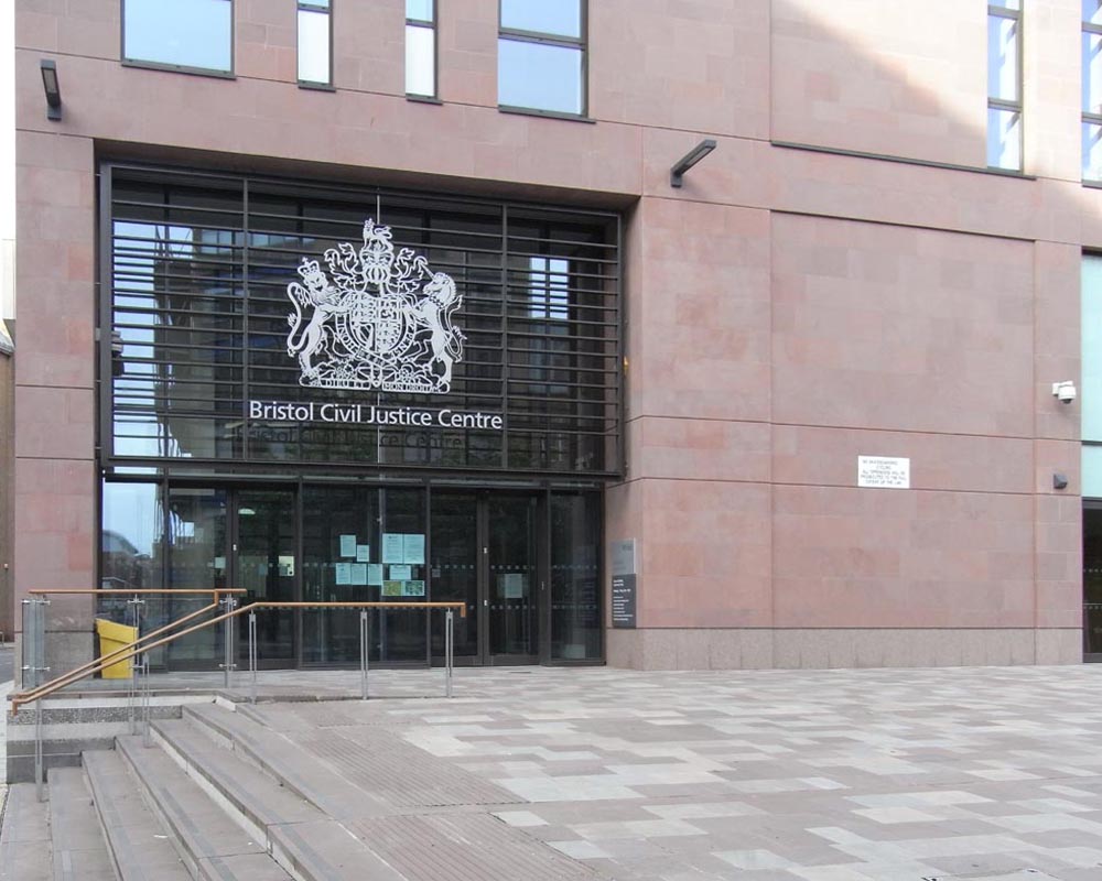
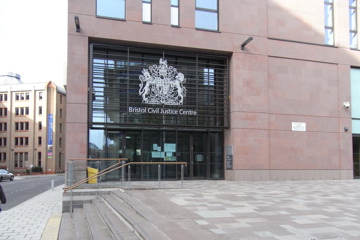
Left: main entrance to new office space.
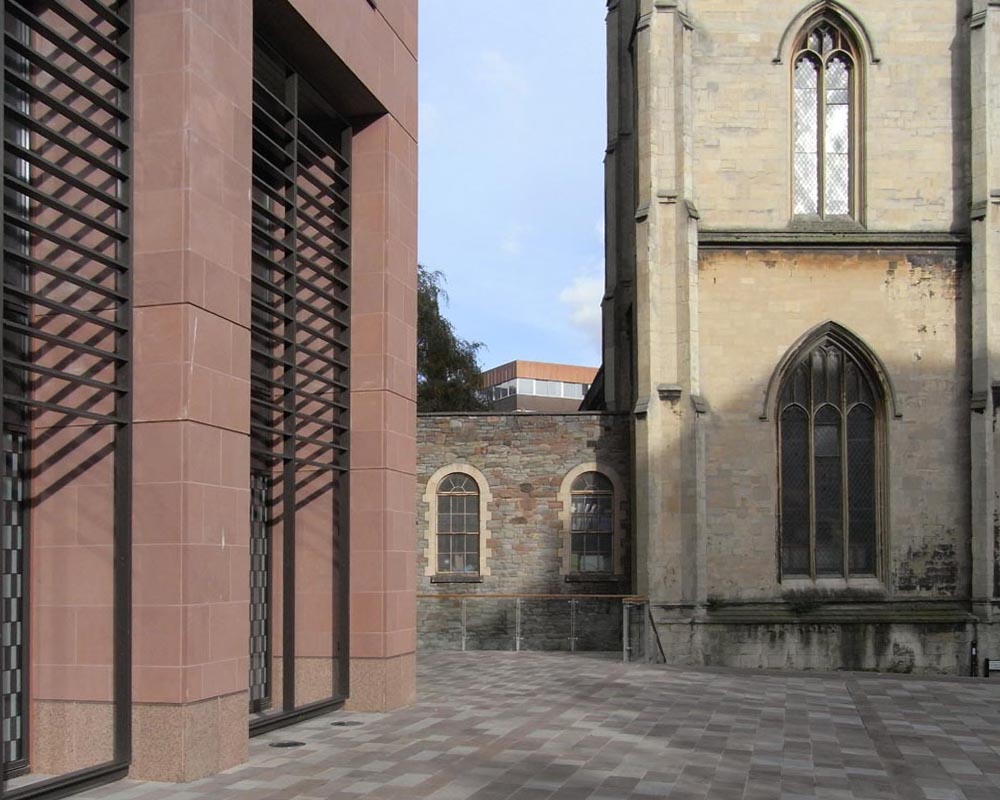
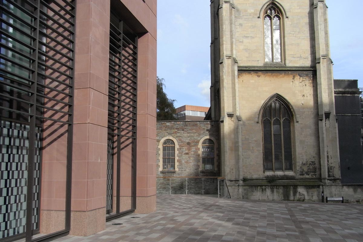
Right: view from plaza towards church.
"Early discussions with the planning department benefit your scheme."
"Early discussions with the planning department benefit your scheme."
The new public plaza connects the church with views across the river.
The Office
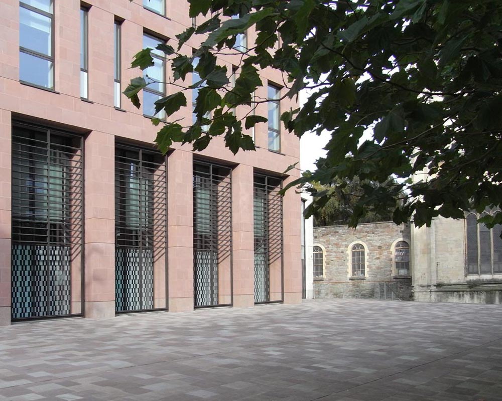
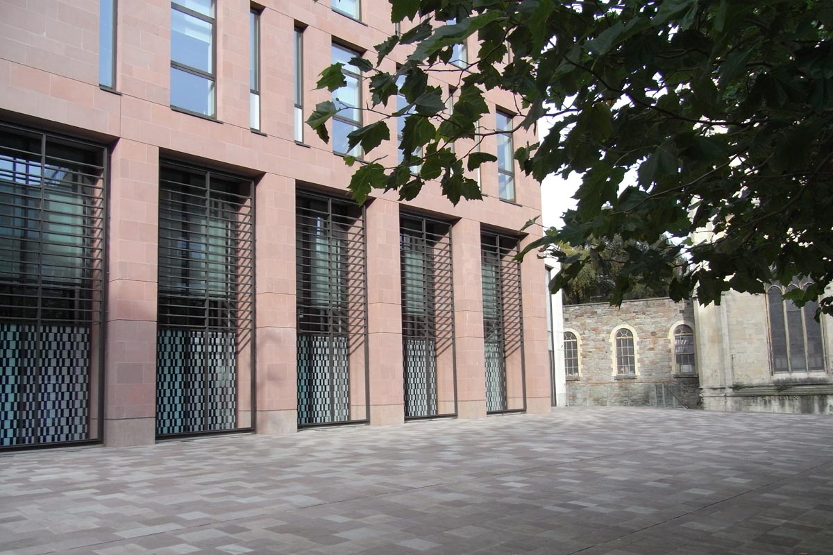
New office with trees in public plaza and church glimpsed to right.
Area Schedules are prepared early so that the financial viability can be assessed.
Lift and Stair Cores
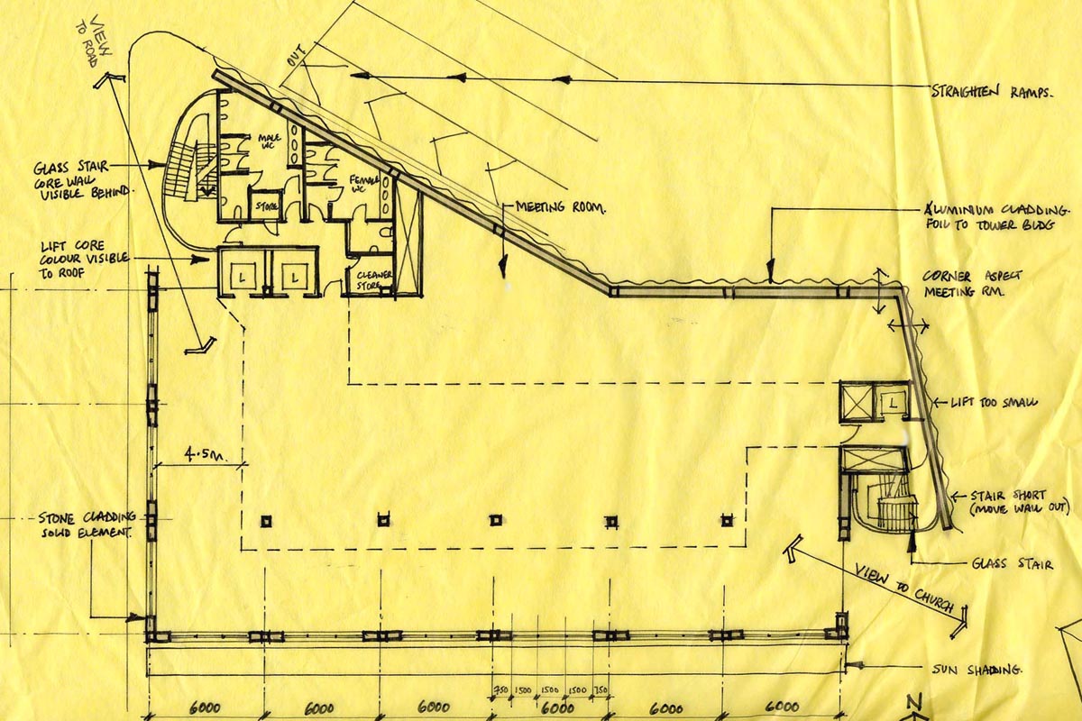
We maximise the net lettable area with careful location of the fire stair and lift cores within the building. The fire strategy is addressed during the initial design stages.
Materials and Finishes
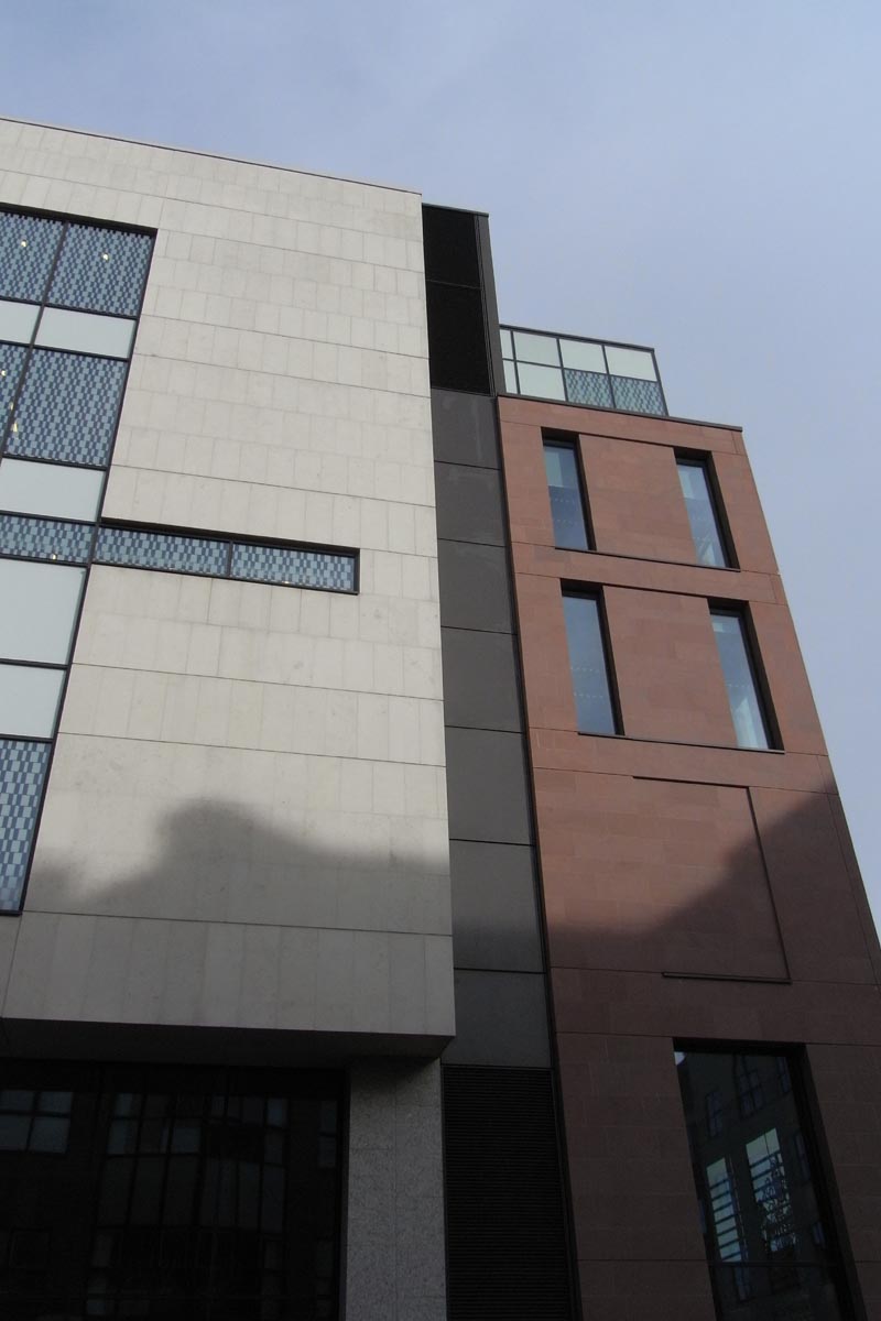
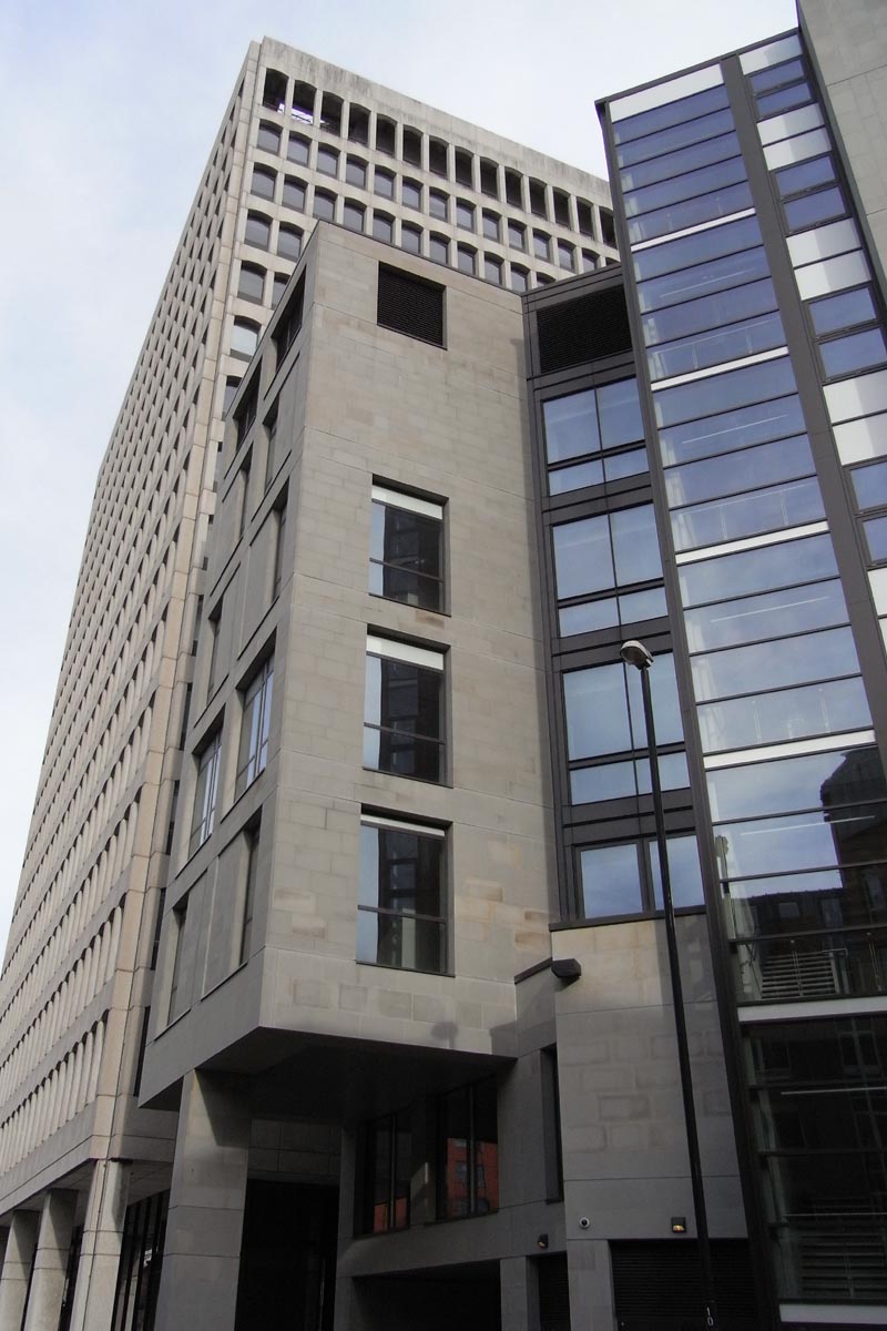
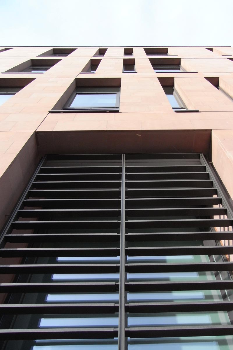
Sandstone cladding with aluminium powder coated shades and windows.
Residential Apartments
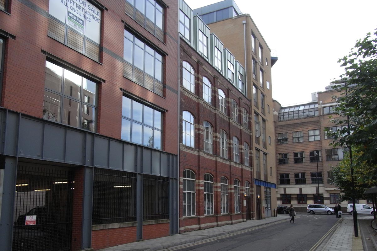
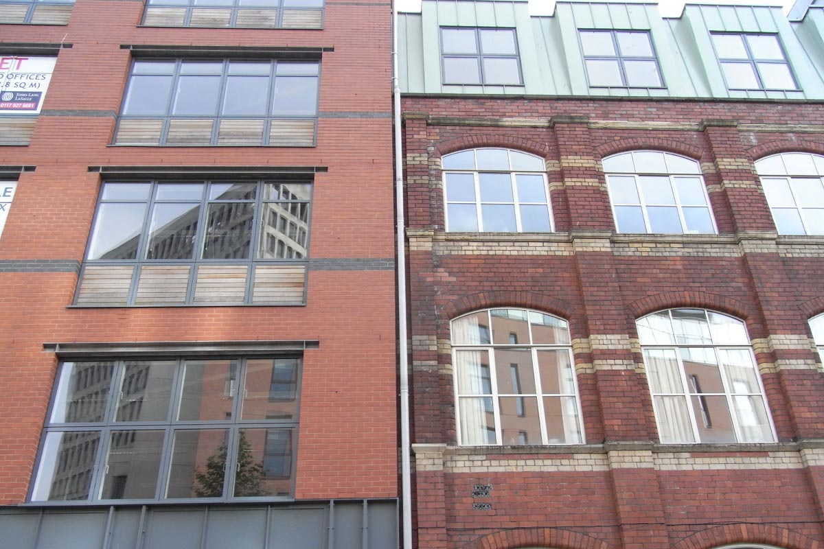
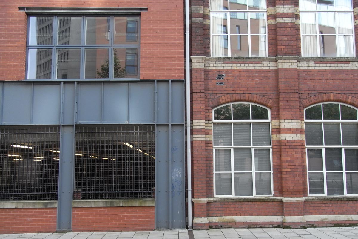
An existing 19th century wharf building was refurbished for residential use and new apartments were designed to flank this building.
"Every project is given equal thought and care."
"Every project is given equal thought and care."
The new apartment design incorporates industrial scale steelwork providing a robust façade on a scale commensurate with the historic fabric.
The Master Plan
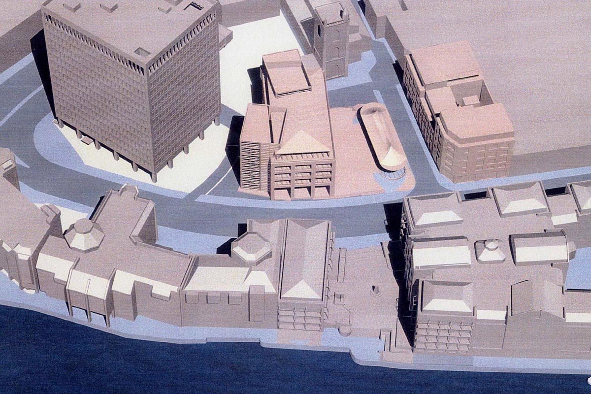
Left: 3D computer model of proposed master plan with church at top and river at bottom.
Right: 3D computer view of proposal looking from the river bank towards the church.
"We provide better living and working environments."
"We provide better living and working environments."
Layout of the master plan. There are three elements:-
1. Residential apartments to the left.
2. Office development to the right.
3. Central raised public plaza with space for a restaurant.
Concepts and Design
The new office development has two stair cores located at either end of the building and the façade is pulled back at these points to reveal the structure behind.
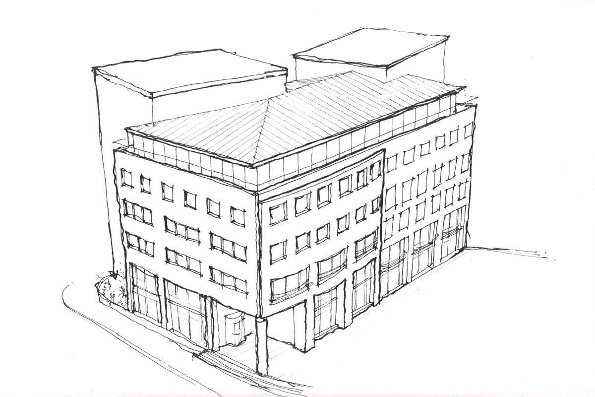
Concept Sketches
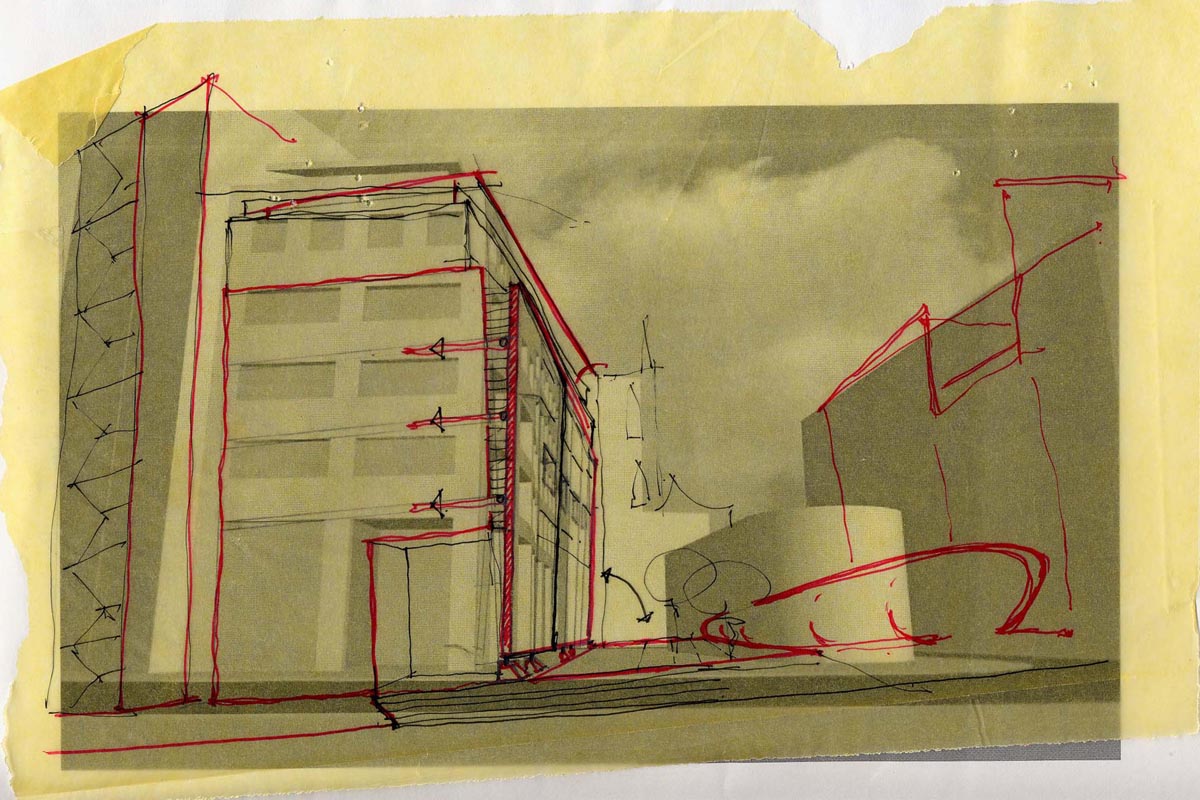
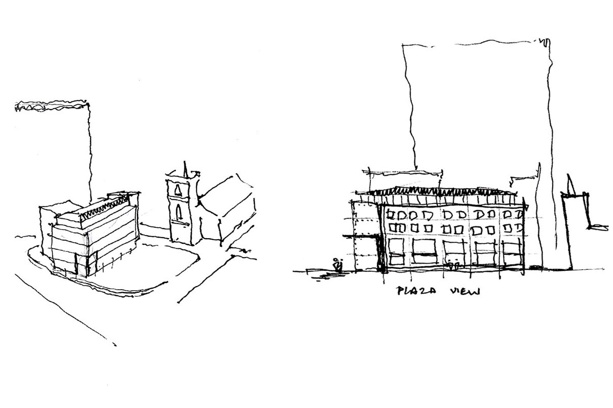
Sketch ideas for office massing and elevation studies.
Facade Studies
Early options for the façade designs explored ideas for unifying the office and residential buildings. Both were to be completed with a modern glazed upper level and cantilevered roof form.
Left: the apartments; render with brickwork revealed.
Right: the office; brickwork with render revealed.
Elevation Studies
Left: Street elevation from the river with the office building on the left and apartments on the right.
Right: Elevation study for the new apartments framing the existing 19th century wharf building.
Full planning permission was obtained first time following an initial pre-application submission.
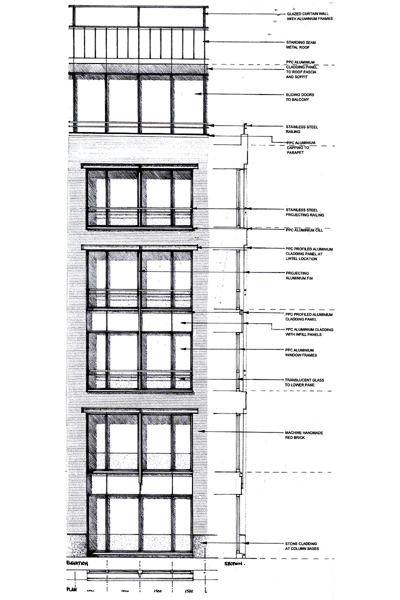
Detailed Planning Drawings
Drawings submitted for full planning approval showing the materials and articulation of the new office and residential facades.



.jpg)
.jpg)
.jpg)
.jpg)
.jpg)
.jpg)
.jpg)