Summary
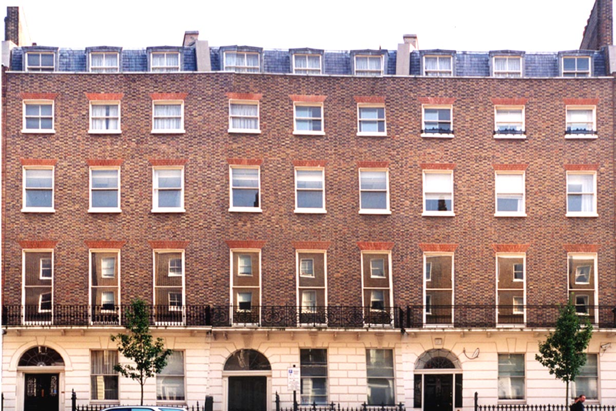
Refurbishment of a grade II listed Georgian style property to provide a new specialist private health clinic for London.
The Brief
Space: to be reassuring whilst presenting a timeless interior enabling patients to navigate easily; clean spaces; calm.
Functions: waiting areas; reception; health screening; consultation rooms; pharmacy; admin; 21 consultants suites; dermatology, diabetes, and radiology departments; café; gardens; deliveries; plantrooms.
Overview
Whilst working as a project director at Terry Farrell & Partners our director, Sean Stanley, ran this project from the initial design briefing stage through to construction.
The client asked for a ‘wow factor’ and we explored numerous layouts and concepts with them.
Once clear objective that remained throughout the design and construction phases was that patients should be able to orientate themselves from anywhere, and to anywhere, within the building without relying on numerous wayfinding signage.
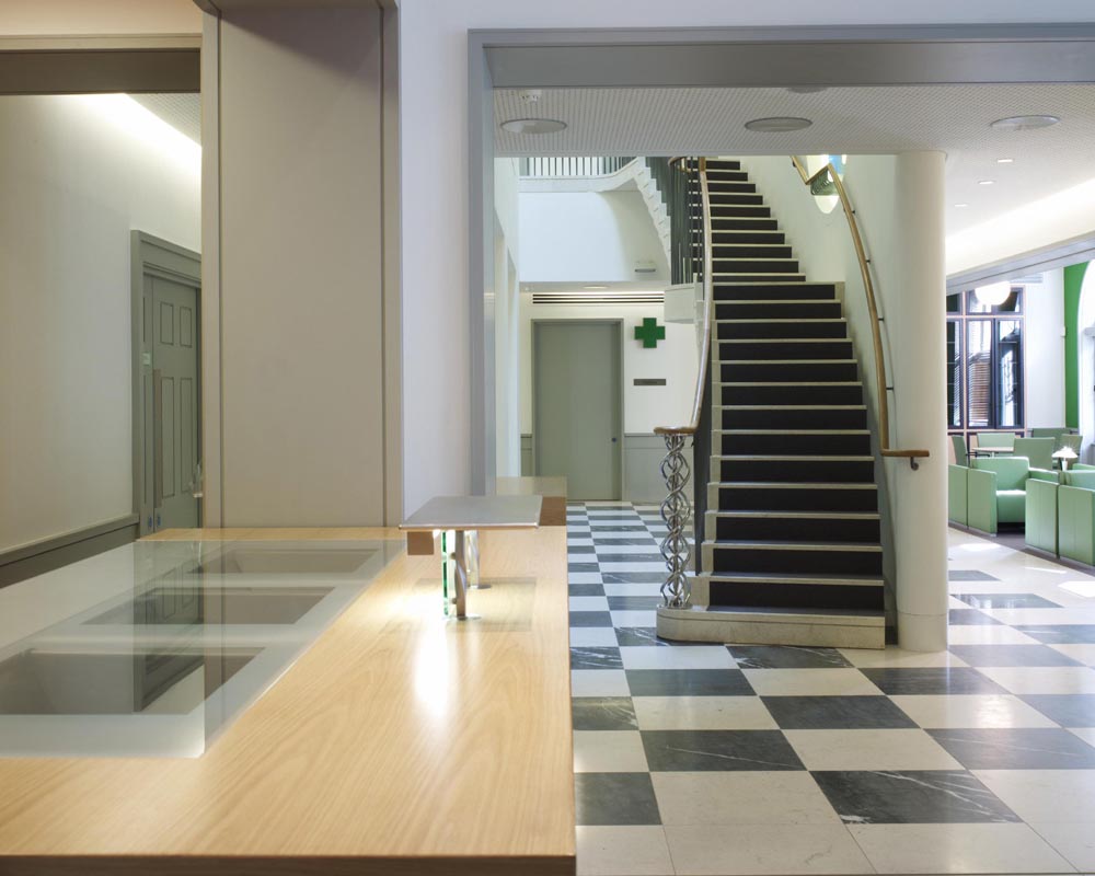
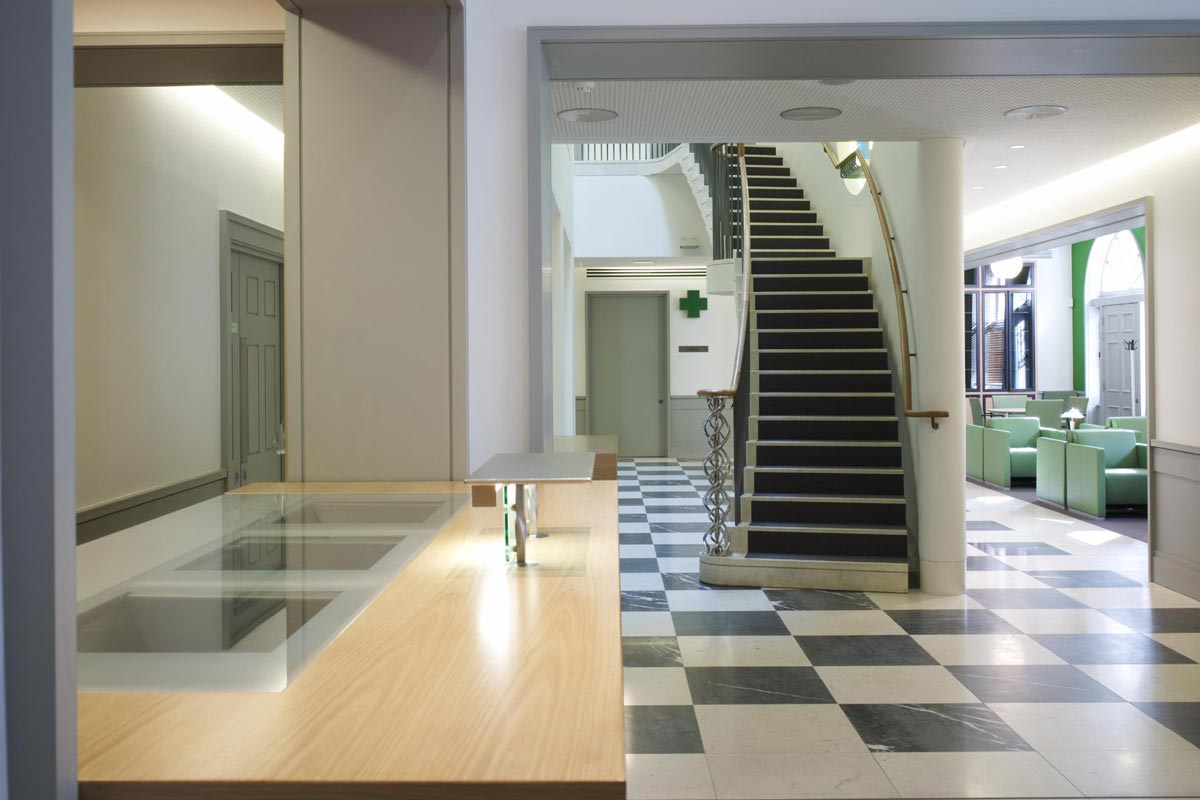
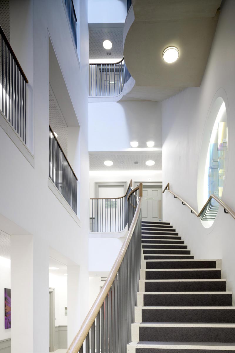
From the main reception desk the new central atrium is revealed with a feature staircase ascending to the private consultation rooms on the floors above. The main waiting area is to the right.
Context
Left: photograph of the main façade in Devonshire Place.
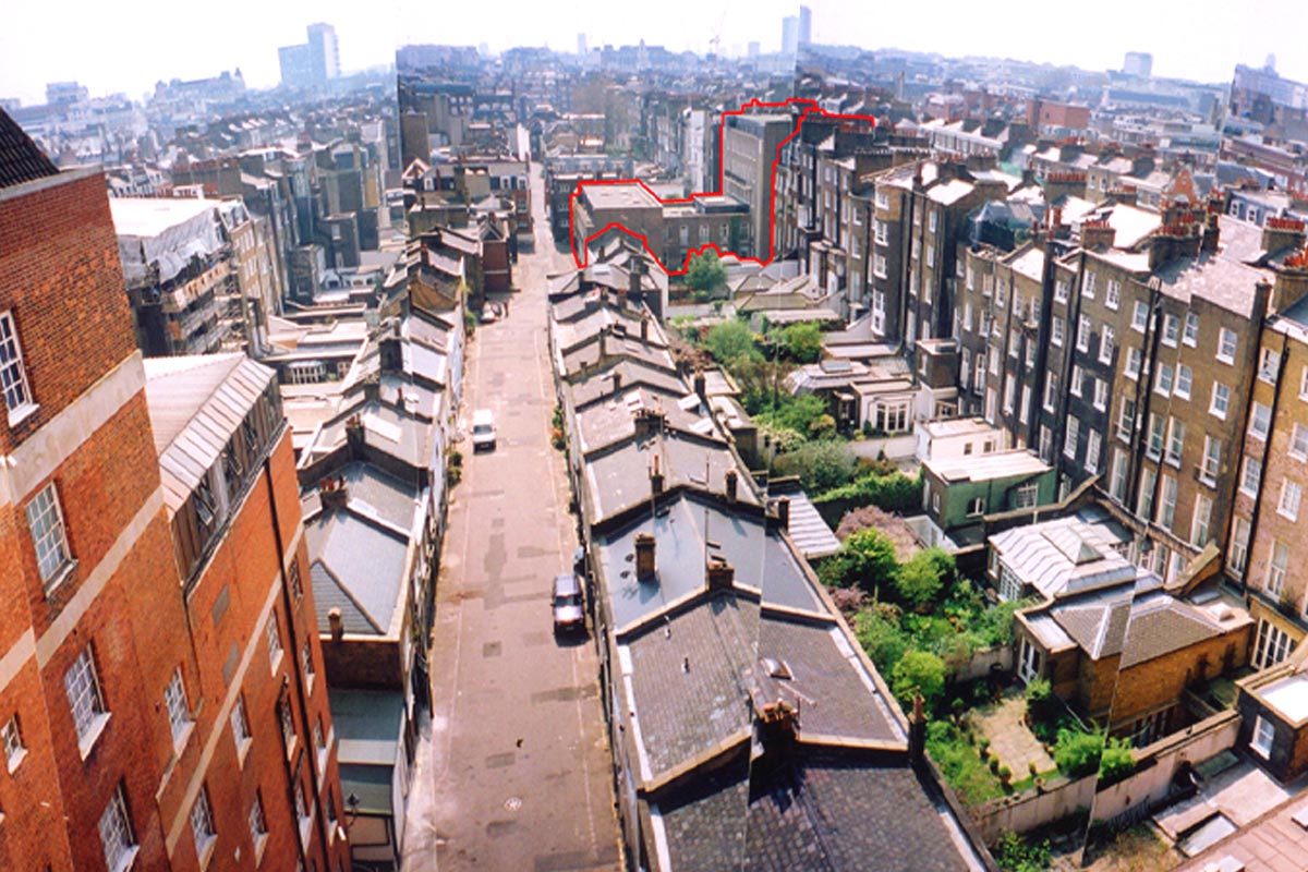
Right: view of the rear residential mews behind the clinic.
"We listen to our clients and together we creative unique and inspiring designs."
"We listen to our clients and together we creative unique and inspiring designs."
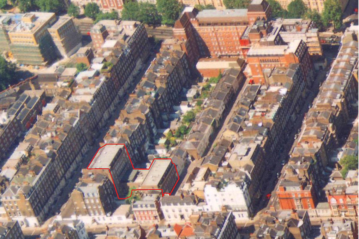
This aerial photograph shows the location of the property outlined in red, with the main London Clinic hospital on Euston road at the top of the image. Devonshire Place and Harley Street run parallel to each other, either side of the new health clinic.
Concept and Design
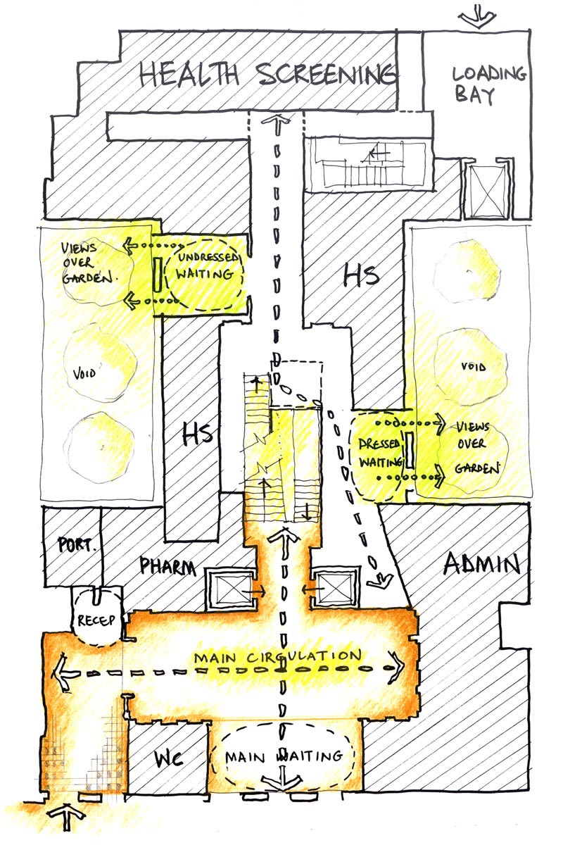
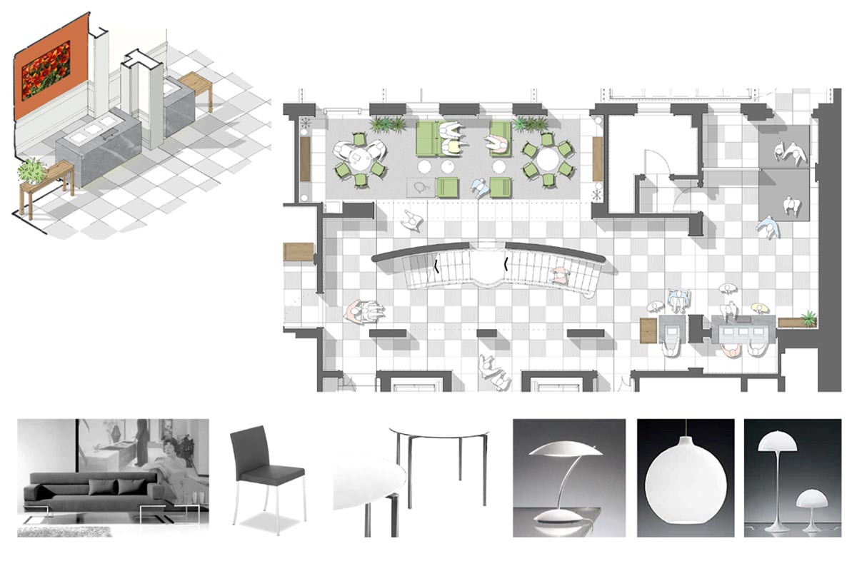
Left: early ground floor layout. All waiting rooms were placed with access to external courtyards.
Main entrance from street at bottom left. The central atrium is only discovered after the visitor arrives at reception.
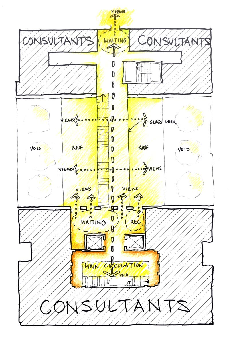
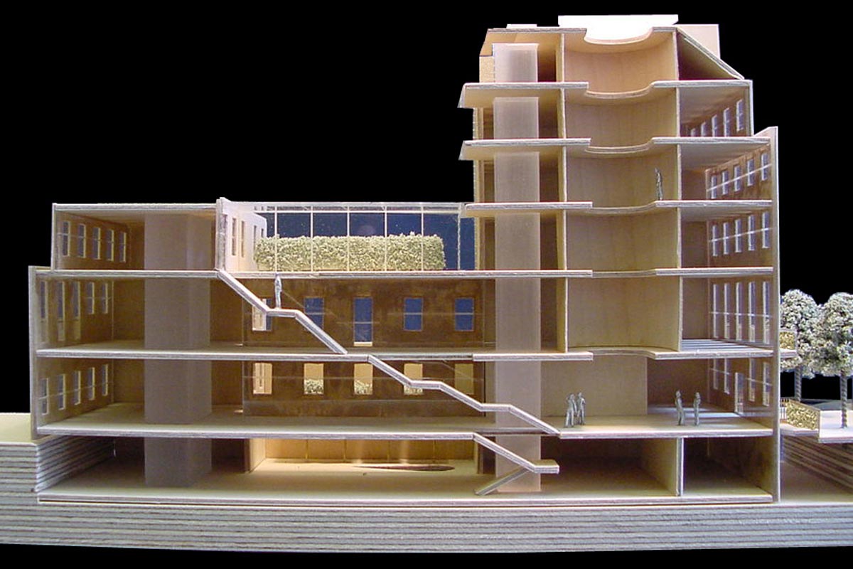
From the atrium views are possible to all areas; directly up to the four floors containing the private consultants’ suites; or through to the rear areas of the building connected with a long straight staircase (see sectional model image below).
Right: early upper floor layout. At the second floor the visitor is directed through a glazed enclosure at roof level and this links the front and rear building areas.
Interior Spaces
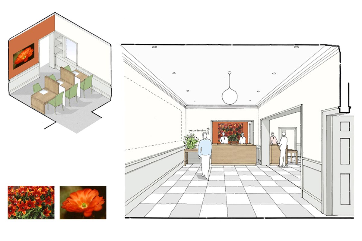
Left: ground floor entrance lobby, reception and main atrium area.
Right: view from main entrance to visitor reception.
"We get to the heart of your unique requirements and provide a bespoke, tailored solution."
"We get to the heart of your unique requirements and provide a bespoke, tailored solution."
This sectional model through the building shows the new atrium inserted to the front and the staircase in the middle that provides a legible route to the rear departments and gardens.
During the Briefing Stage we met every consultant for an individual meeting to capture their specific room layout and furniture requirements. We also arranged meetings with all department teams. This information was then collated into a series of room data sheets that were populated with additional information as the project progressed.
Feature Staircase
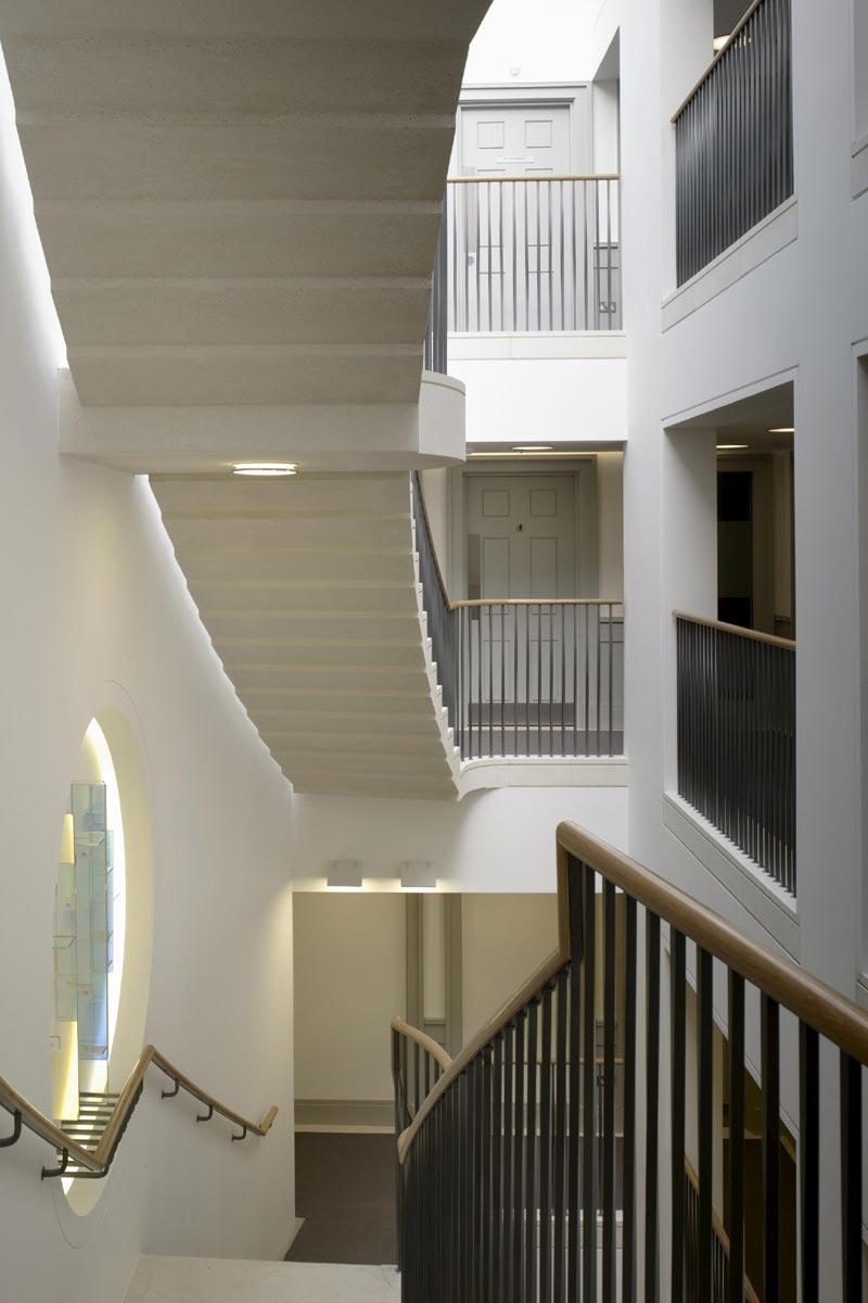
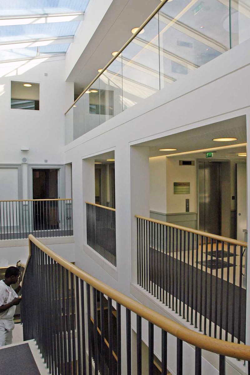
Left: view within the atrium looking across a typical consultants’ floor. The underside of the staircase is visible and this was designed to be separated from the continuous curved vertical spine wall.
Working with a specialist manufacturer the staircase is a highly crafted precast concrete stair with black iron twisted spindles and timber handrail.
Right: view within the atrium looking up.
Waiting Areas
Nursing staff were closely involved with the design of the nursing stations and department reception and waiting areas.
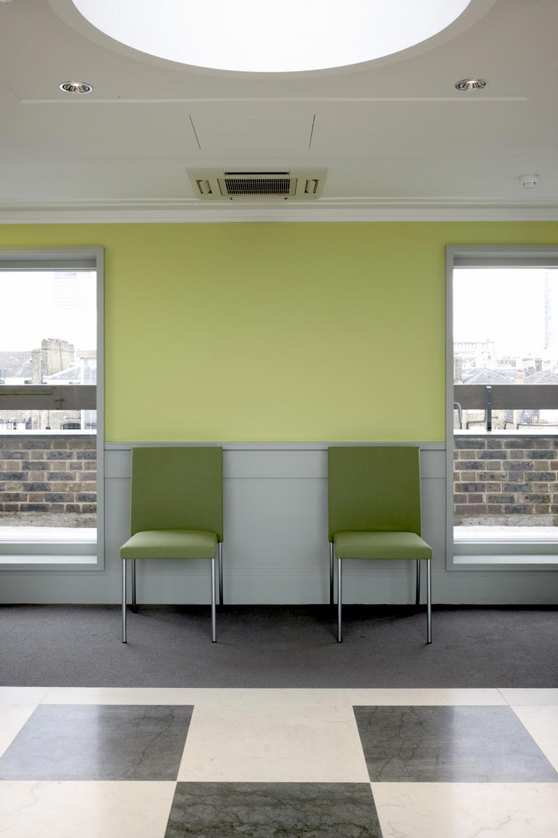
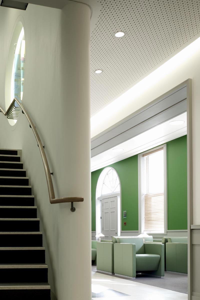
Colour was used to signify areas where visitors could wait between treatments.
Lift Lobbies
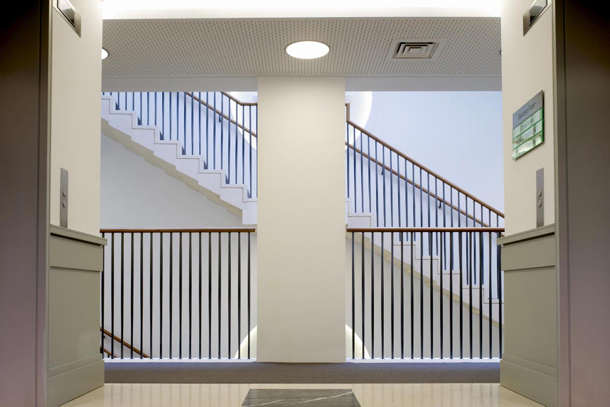
View from a lift lobby towards the atrium with the feature staircase beyond.
Healing Gardens
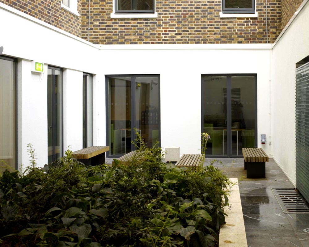
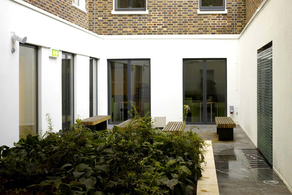
Courtyards were designed to be easily accessible from the waiting rooms and café on the lower ground floor. A specialist consultant advised where planting with medicinal properties should be located and a water feature completed these peaceful spaces.
The Wow Factor
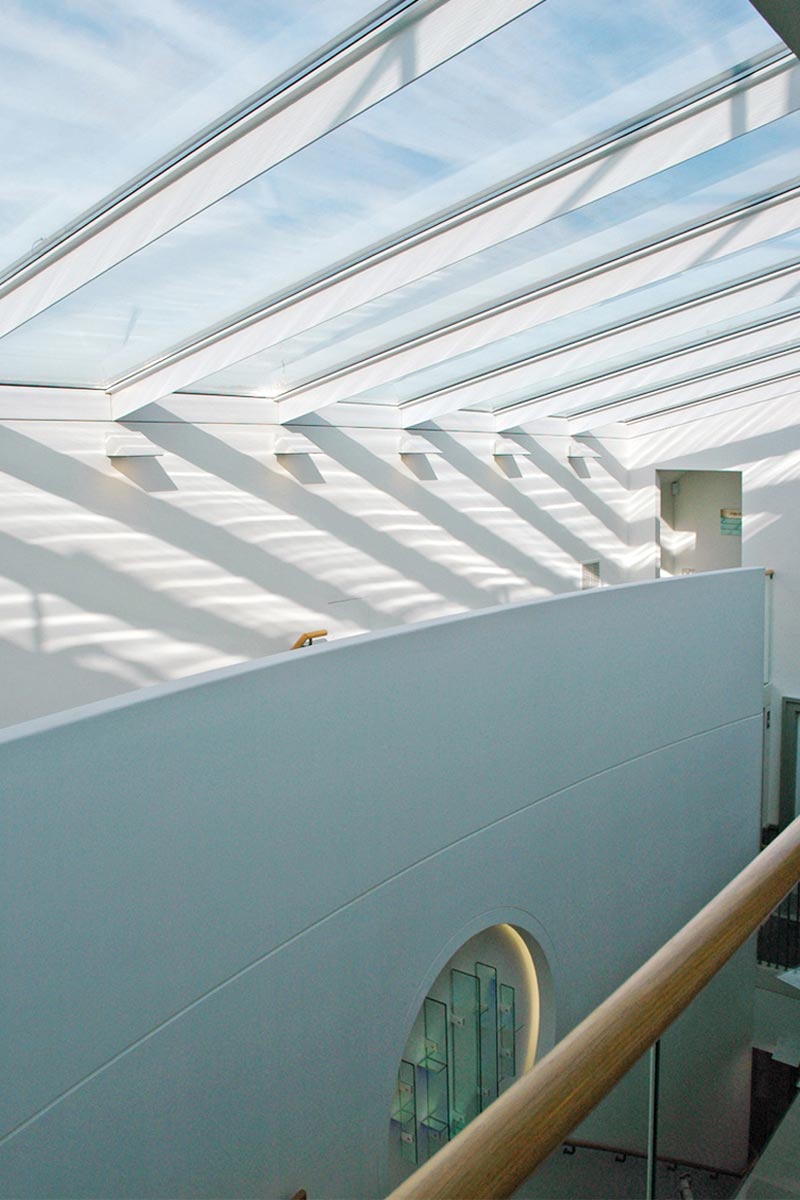
Left: at the top floor of the atrium the curved staircase wall terminates and the space opens up to allow daylight to flood the lightwell.
Right: The design detailing is stripped back to simpler lines and the balustrading is now glazed to enhance the feeling of openness.
Glazed Roof Link
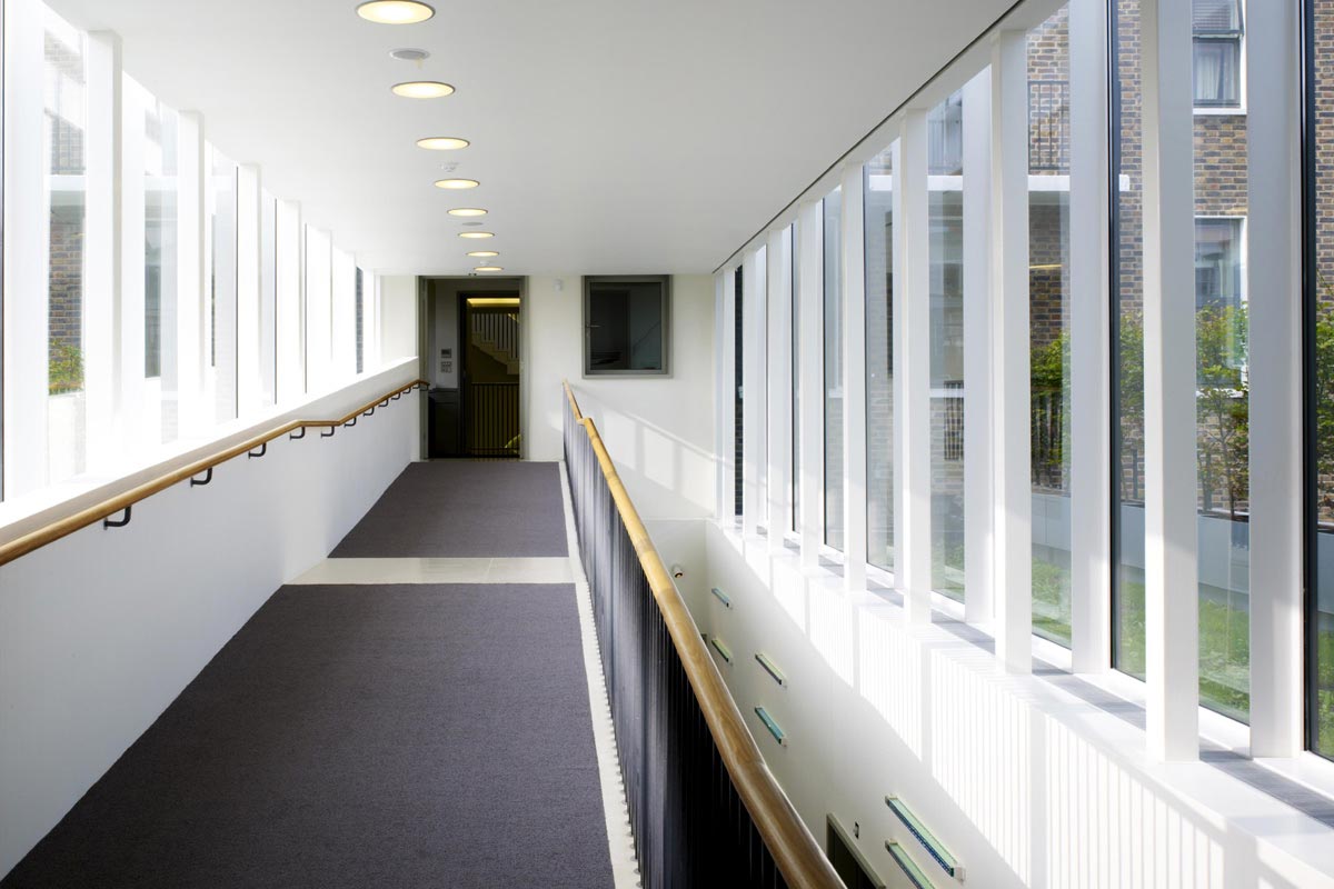
View looking along the glazed enclosure that links the front and rear buildings.
Through the glass the flat roof can be seen. This area was planted with sedum and wild flowers, surrounded by a low hedge by the parapet.
The ceiling was designed with a set back at the edges to allow the glazing system and roof junction to be concealed, drawing the eye up and emphasising the external nature of this environment.


